About
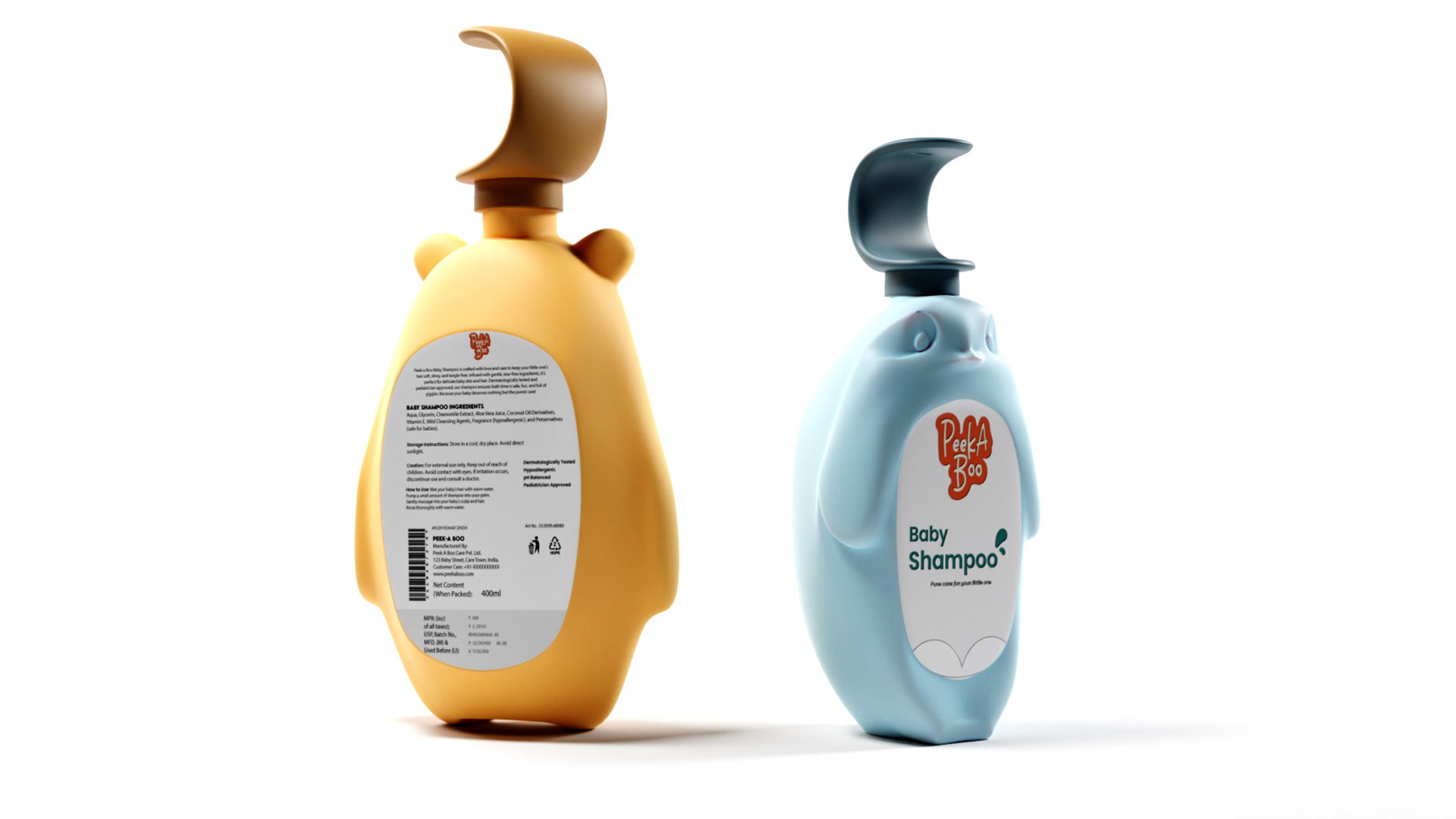
Peek-a-Boo is a playful bath essentials concept where the packaging becomes part of the product experience rather than simply holding the product. Inspired by familiar animal forms, the bottles are designed to be engaging and approachable for children while remaining practical, safe, and easy for parents to use.
Read more
Brief
Designing a baby shampoo bottle that goes beyond being a container to become part of the experience, engaging for babies, practical for parents, and thoughtful in both form and function.
Peeka A Boo
Academic Module
Branding and Packaging
2 Weeks

2025




Market Research
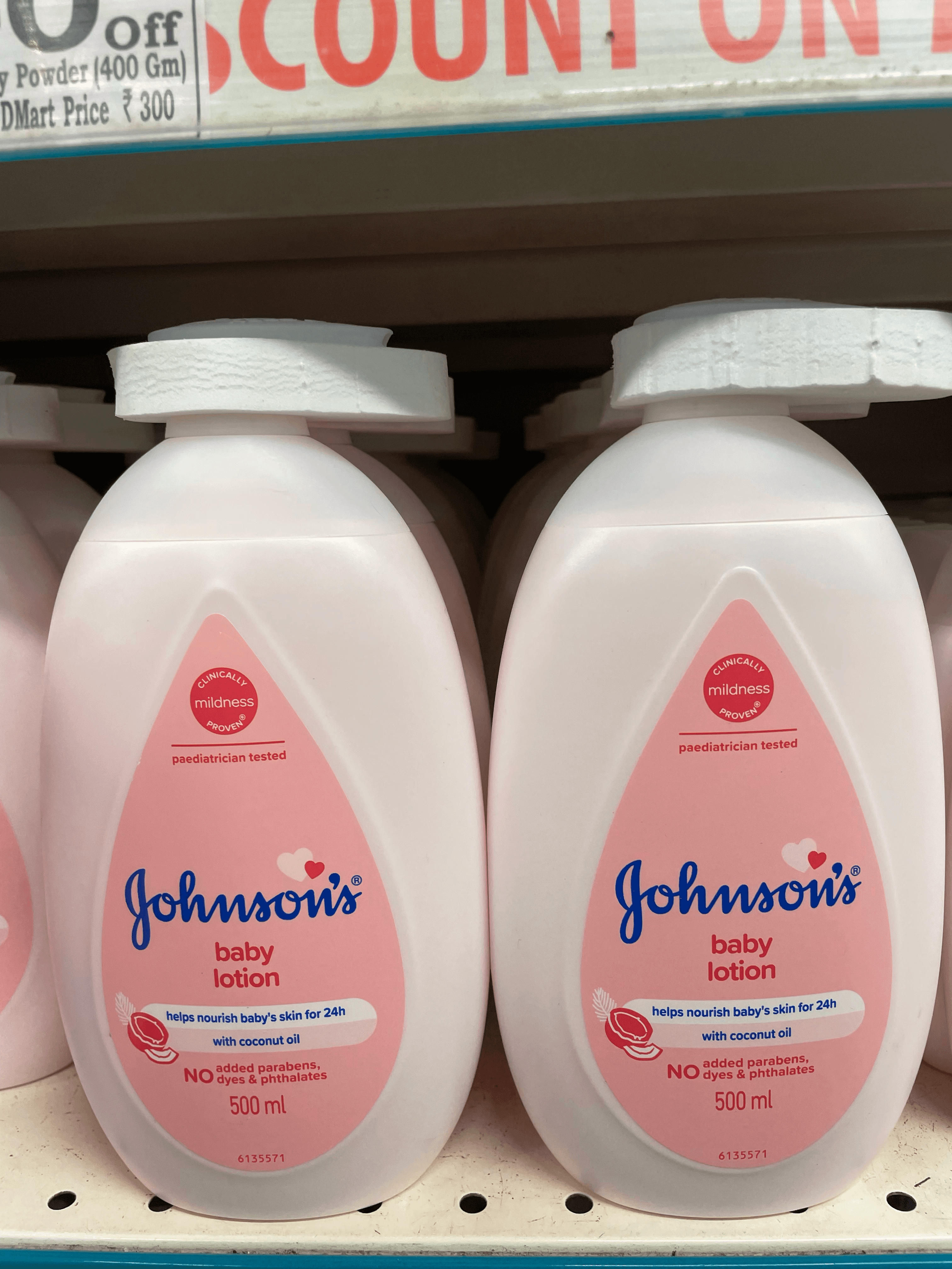
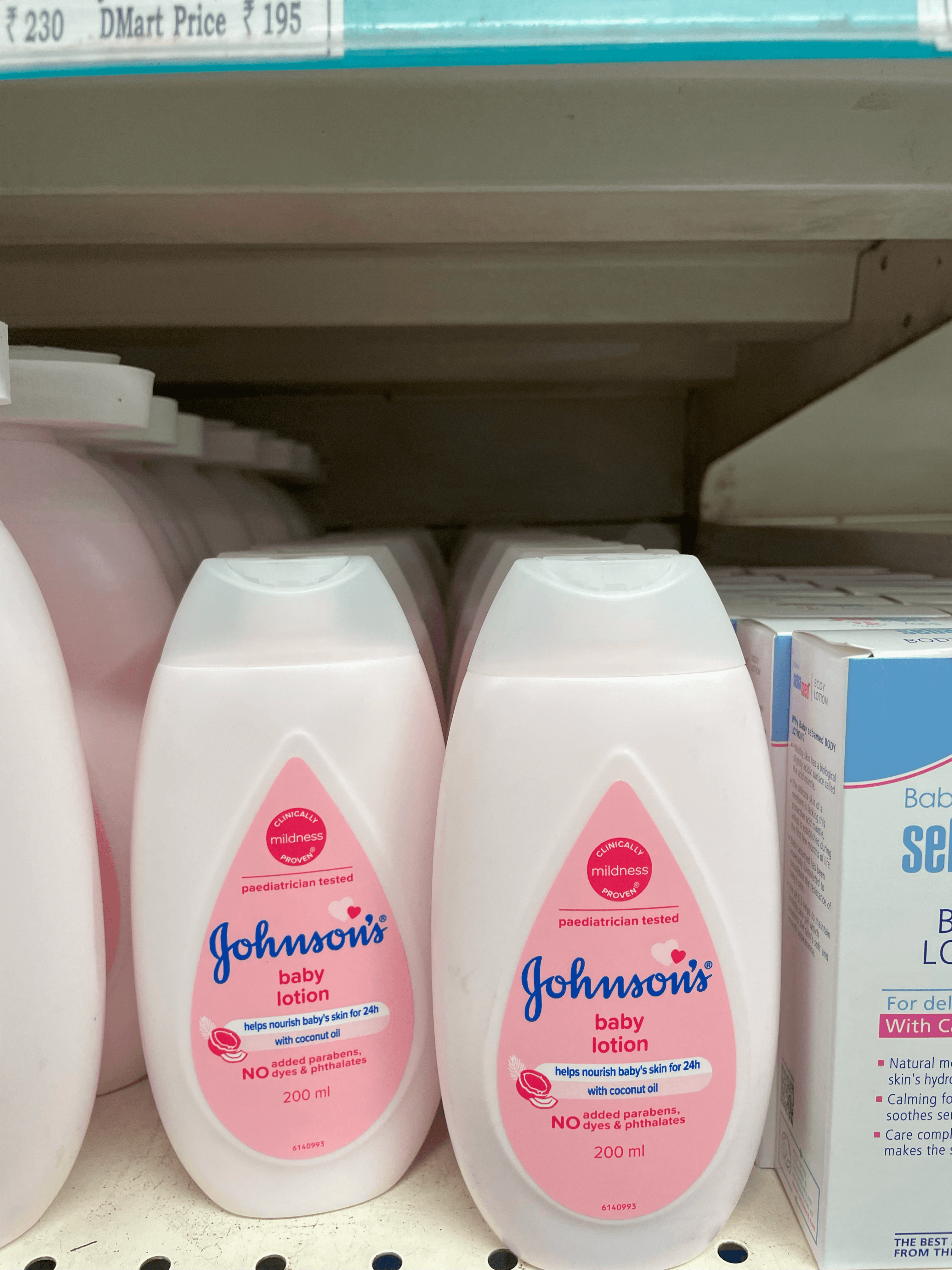
During visits to Star Bazaar and DMart, I studied the baby shampoo section to understand product placement and market competition. Most shampoos were positioned within the baby care aisle alongside related products such as lotions and powders, making them easily accessible to parents.
Prominent Competitors
Johnson’s Baby
Himalaya
Mamaearth
Sebamed
Clinical Appearance
The typography is straightforward and resembles medical product labels, using clear, bold fonts to emphasize claims such as
pH-balanced, hypoallergenic, and dermatologically tested.
Product claims are communicated in a factual, scientific manner rather than through emotional or playful messaging.
Lack of Playful Imagery
Unlike traditional baby brands that use soft illustrations, mascots, or whimsical designs, these brands largely avoid playful imagery. This gives them a more serious, clinical, and professional appearance.


Emotional Connection
Many baby shampoo bottles look too clinical, resembling medical products rather than something designed for babies. Softer colors, playful shapes, and a more inviting aesthetic could create a stronger emotional bond with parents and children.
Ease of Use
Flip caps are not the most practical choice for parents who need to manage a wet, squirming baby during bath time. A more intuitive, single-handed dispensing system would improve usability.
Insights
Dispensing Issues
Push nozzles can be confusing in orientation, often leading to product wastage. A design that ensures efficient dispensing without leftover residue would add value and convenience.

Form Generation
Each form was developed to express a distinct character through its shape. Smooth contours suggest purity, soft curves create a sense of gentleness, and playful details add a sense of joy, creating packaging that feels safe, comforting, and engaging for both parents and babies.
Read more


Hover Over Me !!
Form Evolution
Branding
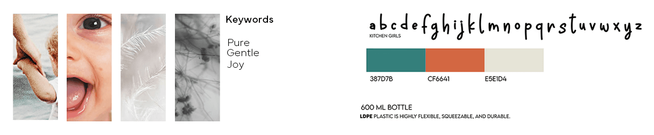
The Peek-a-Boo branding is built around playfulness, warmth, and familiarity. Soft colors, rounded forms, and a friendly visual language create an identity that feels approachable to both children and parents, while the playful typography and animal-inspired elements reinforce the idea of turning everyday bath time into a more engaging experience.